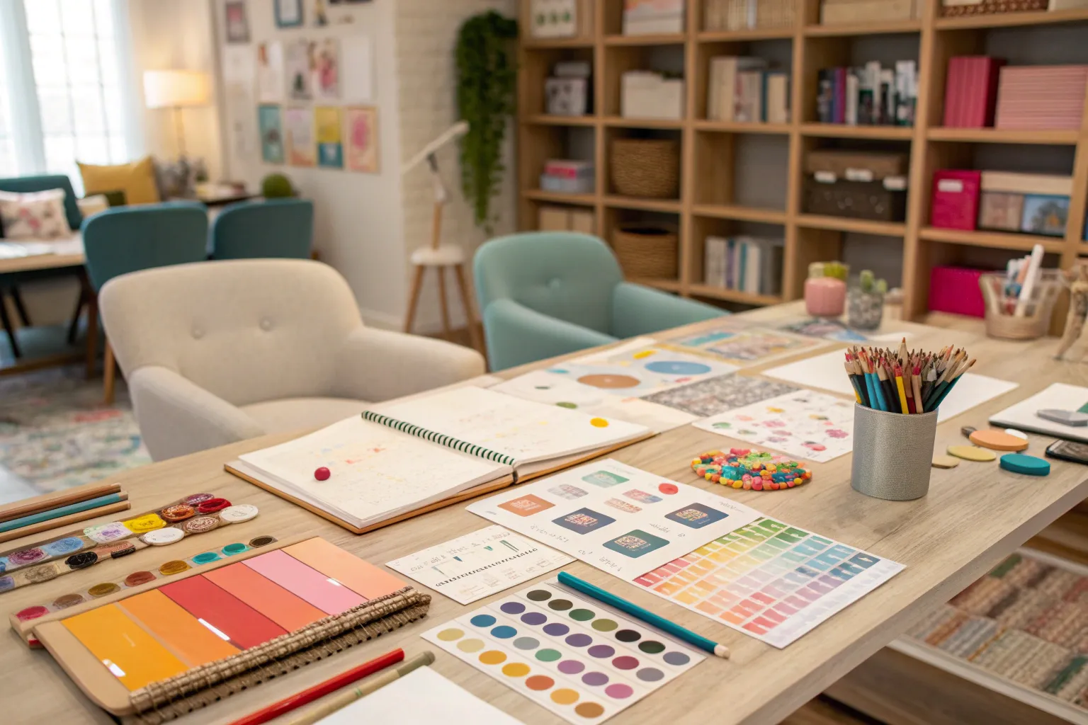
Creating meaningful spaces begins long before the first plant enters the ground or the first paint stroke touches a wall. A vision without a roadmap remains just that—a vision. The transformation from inspirational collage to finished environment requires a structured approach that grounds creativity in reality while preserving the spark that makes each project unique.
The Foundation: Understanding Design Vision Boards

Design vision boards—often called mood boards or concept boards—serve as visual anchors throughout the creative process. These curated collections of images, textures, colors, and materials translate abstract ideas into tangible references that guide every subsequent decision. I’ve found that the most effective boards balance aspirational aesthetics with practical considerations, creating a bridge between dream and execution.
The distinction matters: a mood board captures feeling and atmosphere, while a concept board advances toward specific materials and implementation details. Both play essential roles at different project phases. Early explorations benefit from loose, emotion-driven collections that prioritize sensory experience over technical specifications. As designs mature, boards evolve to include precise material samples, scaled layouts, and technical considerations that inform construction.
Key Elements of Effective Vision Boards:
- Color palette (3-5 primary colors with supporting neutrals)
- Texture samples (physical or high-resolution digital representations)
- Material references (specific products, finishes, or natural elements)
- Spatial inspiration (photography showing scale, proportion, and arrangement)
- Atmospheric imagery (lifestyle photos, natural scenes, or abstract elements that convey feeling)
Building Your Visual Vocabulary
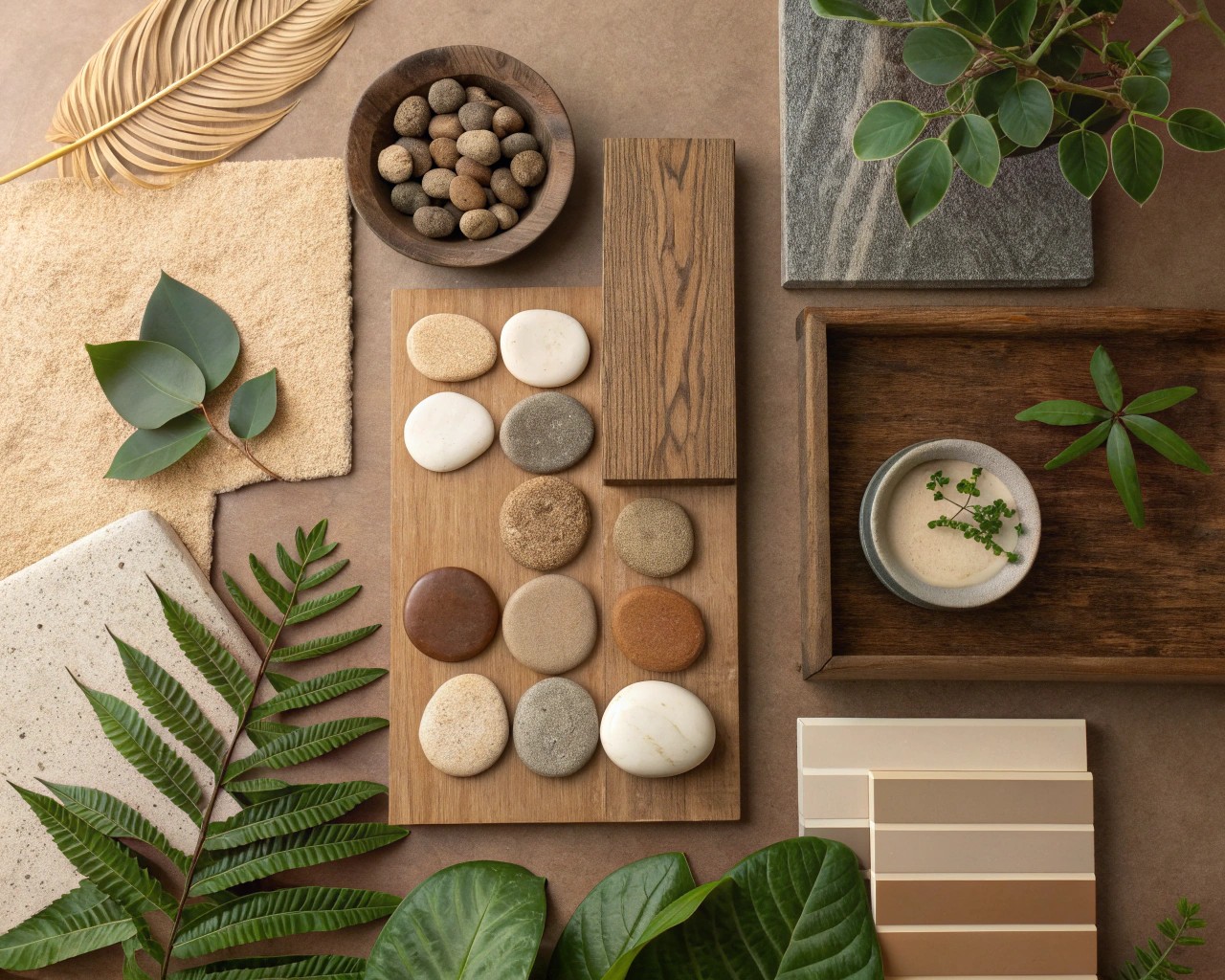
The collection phase demands both discipline and openness. Begin by establishing 3-5 descriptive words that encapsulate the intended atmosphere—terms like “serene,” “dynamic,” “organic,” or “structured” become filters for every image considered. These anchoring concepts prevent the common pitfall of accumulating beautiful but disconnected elements that fail to cohere into a unified vision.
Source broadly but curate ruthlessly. Pinterest offers convenient starting points, but limiting inspiration to algorithmically curated feeds produces derivative work. I walk properties at different times of day, observing how light transforms surfaces. Visit botanical gardens, architectural sites, and even unrelated environments like museums or natural landscapes. A sunset’s color gradient or the way moss colonizes stone can spark insights no digital search would surface.
Physical samples remain irreplaceable for texture-dependent decisions. Screen representations of fabric weight, stone grain, or wood character inevitably fall short. For critical material selections, invest time obtaining actual samples—a 4-inch square of limestone reveals subtleties that thousand-pixel images cannot. This tactile component grounds boards in material reality and prevents selections that photograph beautifully but feel wrong in person.
Color Theory in Practice
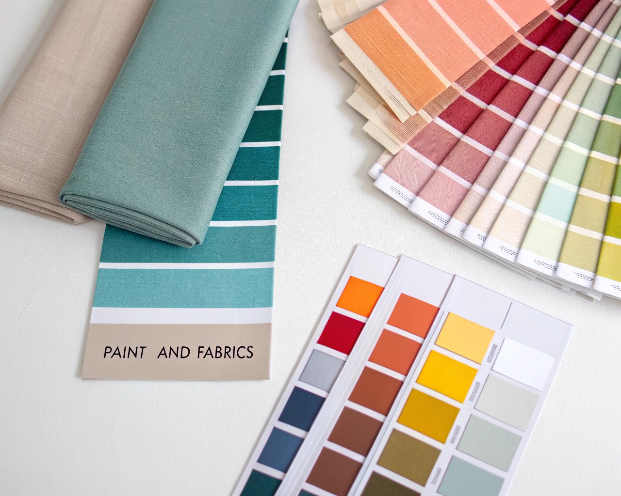
Color selection extends beyond personal preference into psychological territory. Warm tones (those leaning toward yellow and red) create energy and intimacy but can overwhelm in large applications. Cool colors (blue-leaning variants) recede visually, expanding perceived space while promoting calm. The temperature difference between a warm gray and cool gray—though subtle on a screen—transforms how a room or garden feels throughout the day.
Natural light dramatically affects color perception. A palette that sings in morning’s cool illumination may appear muddy under afternoon’s warmer rays. Test colors at the actual site during different times and weather conditions. For landscape work, consider how seasonal light shifts—winter’s low angles produce different effects than summer’s overhead brilliance.
Practical Color Palette Development:
| Element | Function | Consideration |
|---|---|---|
| Dominant color | Sets overall mood, covers 60% of space | Select based on desired atmosphere and light conditions |
| Secondary color | Supports dominant, adds interest (30% coverage) | Should harmonize while providing subtle contrast |
| Accent colors | Creates focal points (10% coverage) | Higher intensity acceptable due to limited use |
| Neutrals | Grounds palette, provides visual rest | Consider warm vs. cool undertones carefully |
From Inspiration to Implementation
The transition from board to built environment represents the critical juncture where many projects stumble. Abstract concepts must translate into specific products, plants, or construction details. This phase requires systematic evaluation of each board element against practical constraints: budget, availability, maintenance requirements, climate suitability, and client lifestyle needs.
I develop implementation matrices that connect inspirational images to actionable specifications. An atmospheric photo of a Mediterranean courtyard might inspire three concrete decisions: warm limestone pavers, drought-tolerant plantings in a specific palette, and wrought-iron furniture with particular patina characteristics. This explicit translation prevents the disconnect where finished spaces technically match the board but somehow miss its essence.
Translation Strategy:
For each major board element, document:
- Inspirational source (the original image or sample)
- Design intent (what quality or feeling it represents)
- Specific application (where and how it manifests in the project)
- Product specifications (exact materials, plants, or products selected)
- Implementation notes (installation requirements, maintenance considerations)
Material availability constraints demand creative problem-solving. The Italian terra-cotta pavers that inspired a Mediterranean design may prove impractical for a Colorado climate, requiring adaptation to locally-sourced alternatives that capture similar warmth and texture while withstanding freeze-thaw cycles. Successful translation maintains design intent while respecting site realities.
Texture and Materiality
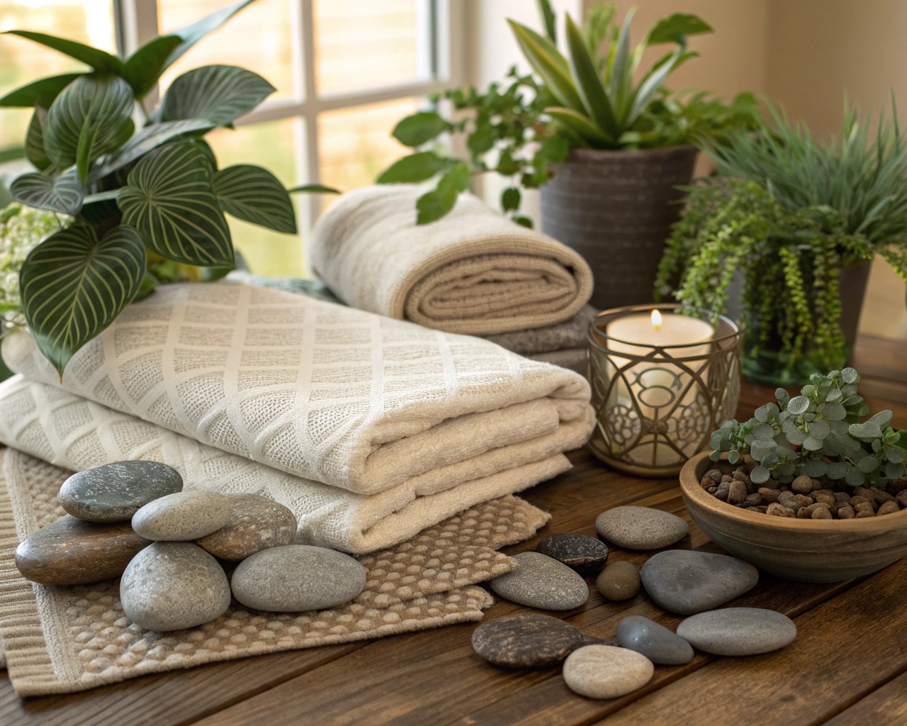
Texture creates complexity that elevates designs from pleasant to compelling. The interplay between rough and smooth, matte and reflective, soft and hard generates visual interest while serving functional purposes. In landscape work, the contrast between fine-textured grasses and bold hostas, or smooth river rock against rough granite boulders, creates rhythms that guide the eye and define spaces.
Layering textures requires restraint. Too many competing surfaces create visual chaos; too few produce monotony. I aim for 3-5 distinct textural categories per space, varying their prominence. A living room might feature smooth painted walls (recessive), nubby linen upholstery (moderate), polished wood floors (reflective), and rough stone fireplace surround (dominant focal point). Each category serves a role without competing.
Texture also affects acoustics and perceived temperature. Soft, porous materials absorb sound and feel warmer—crucial for hard-surfaced modern interiors that risk echo-chamber acoustics. Landscape applications benefit from similar thinking: dense evergreen plantings buffer noise while reflecting less heat than expansive hardscaping.
Seasonal Considerations for Landscape Design
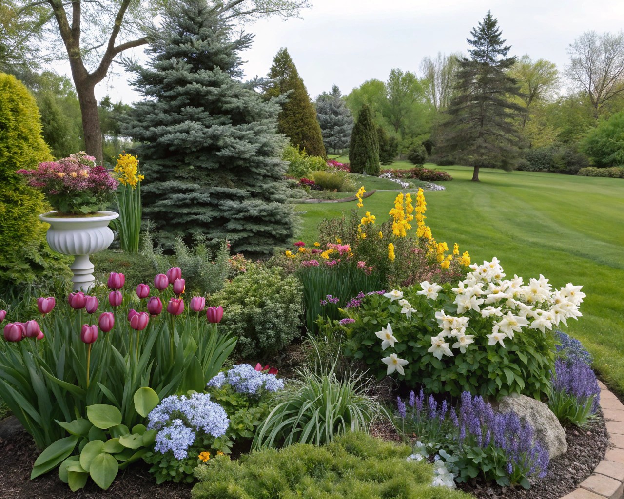
Year-round interest demands strategic planning that extends beyond peak growing season. I structure landscape boards to address four seasonal profiles, ensuring visual appeal transitions smoothly rather than collapsing into barren stretches. This approach requires understanding each plant’s contribution across the calendar—not just bloom time, but foliage texture, fall color, winter structure, and early spring emergence.
Four-Season Planning Framework:
Spring: Focus on early bulbs, flowering trees, and fresh foliage textures that signal renewal. Structure established plantings to frame emerging growth.
Summer: Layer bloom times for continuous color while emphasizing foliage contrasts. Incorporate heat-tolerant species that maintain vigor during stress periods.
Autumn: Capitalize on foliage color, ornamental grasses at peak, and late-blooming perennials. Extend the season with species that transition gradually rather than collapsing after first frost.
Winter: Rely on evergreen structure, persistent seed heads, bark interest, and berried shrubs that support wildlife. Hardscape elements gain prominence, making their design critical.
Hardscaping provides year-round bones that organize space regardless of seasonal plant performance. Paths, walls, and architectural elements maintain visual interest when herbaceous materials retreat. Select materials whose color and texture complement both lush summer growth and stark winter landscapes.
Client Collaboration and Communication
Boards serve as communication tools that align stakeholders around shared vision. Without this visual common language, clients struggle to imagine abstractions while designers risk proceeding based on misunderstood preferences. I’ve learned that early collaborative board development—rather than presenting finished concepts—generates stronger buy-in and reveals priorities that initial conversations miss.
Present boards as starting points for dialogue, not finished mandates. Frame the conversation around questions: “Does this color palette evoke the calm you described?” “Which of these textures feels most appropriate for your lifestyle?”. This approach positions you as guide rather than dictator while gathering nuanced feedback that refines direction.
Document decisions explicitly. As boards evolve through feedback cycles, maintain clear records of what changed and why. This prevents backtracking when someone suddenly questions a direction they previously endorsed. Version control becomes essential—clearly label iterations and reference specific feedback that drove changes.
Effective Presentation Structure:
- Context setting (3-5 minutes): Review project goals and guiding principles
- Board presentation (10-12 minutes): Walk through elements systematically, explaining connections
- Facilitated discussion (10-15 minutes): Gather specific, actionable feedback
- Next steps confirmation (5 minutes): Clarify revisions, timeline, and approval process
Editing and Refinement
Initial collections inevitably contain excess. The editing phase separates functional boards from wishful collages. Step away from work for several days, then return with critical distance. Elements that initially seemed essential often reveal themselves as tangential to core concepts.
Apply the consistency test: does each element reinforce the 3-5 anchoring words established initially? If an image or sample doesn’t clearly support those descriptors, remove it regardless of individual appeal. Boards work through unified storytelling, not maximum content.
Physical boards benefit from iterative arrangement. Before permanently mounting elements, experiment with different organizations. Group by function (all flooring together), by color family, or by room/zone. The arrangement itself communicates—scattered elements suggest busy eclecticism while organized grids convey order and intention.
Digital boards offer flexibility but demand discipline. The ease of accumulation encourages bloat. Set hard limits: 15-20 images maximum for presentation boards. More comprehensive working boards still benefit from organization into clear categories rather than endless scrolling.
Common Pitfalls and Solutions
Derivative design emerges from over-reliance on popular image sources. When everyone mines the same Pinterest boards, homogeneity results. The solution lies in developing unique visual vocabulary through direct observation and unexpected inspiration sources.
Disconnected implementation occurs when beautiful boards fail to translate into cohesive built environments. Bridge this gap through explicit specification development that connects each board element to concrete products or plants. Test whether removing the inspirational image leaves you still able to articulate what it represented.
Scope creep during refinement wastes time and dilutes focus. Establish clear revision parameters upfront. Distinguish between refinement (enhancing existing direction) and restart (fundamentally changing approach). The latter requires acknowledging that initial exploration missed the mark rather than endlessly layering incompatible concepts.
Client misalignment surfaces when boards proceed without adequate input. Involve stakeholders early, even during messy exploration phases. The collaborative process matters as much as the polished result—participation creates investment and surfaces concerns before they derail later stages.
Digital vs. Physical Approaches
Tool selection impacts creative process and client engagement. Physical boards offer tactile authenticity—fabric drape, stone weight, and wood grain read differently in hand than on screen. They excel for material-heavy projects where texture and finish drive decisions. However, physical boards prove cumbersome for remote collaboration and resist easy modification.
Digital platforms enable rapid iteration, remote sharing, and incorporation of dimensional elements like 3D renderings. Software ranging from Canva (accessible) to Adobe Creative Suite (professional) to specialized tools like Morpholio Board (design-focused) offers varying capabilities. The best choice depends on project complexity, collaboration needs, and presentation context.
Hybrid approaches combine strengths. Develop initial concepts digitally for easy exploration and sharing, then create physical sample boards for final material decisions requiring tactile assessment. This workflow balances efficiency with sensory accuracy.

