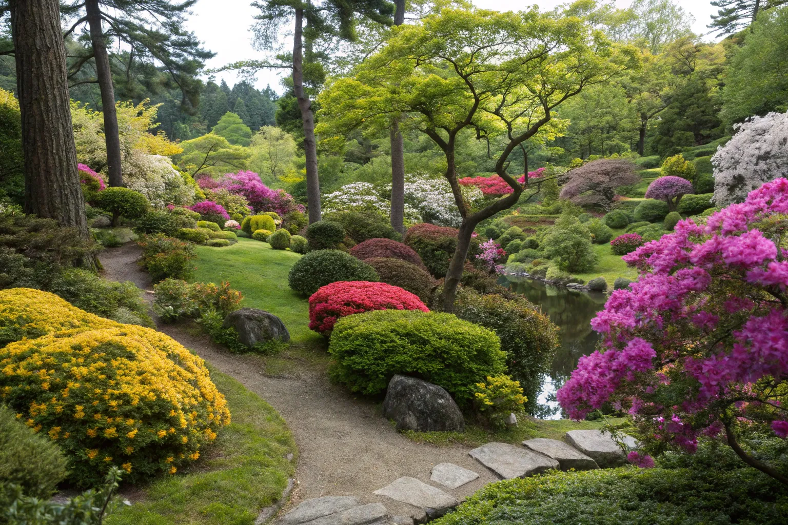
When I walk through a meadow or forest edge, the colors never feel forced or accidental. Plants arrange themselves in harmonies that feel inevitable—the way purple asters catch late sunlight against golden grasses, or how white woodland flowers emerge beneath a canopy of spring greens. These natural color relationships hold lessons we can bring into the garden.
Understanding Color Through Nature’s Lens
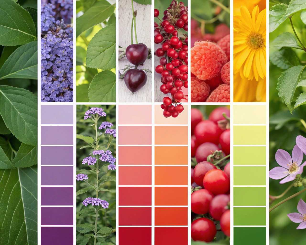
The color wheel offers a useful framework, but observing natural plant communities provides something more valuable: an understanding of how colors actually behave in living landscapes. In natural settings, color relationships develop through environmental pressures, seasonal rhythms, and the physical properties of light interacting with plant tissues.
The Science of Plant Color
Plant pigments—anthocyanins, carotenoids, and chlorophylls—create the spectrum we perceive as flower and foliage color. These compounds serve functional purposes: anthocyanins protect tissues from UV radiation and temperature stress, while carotenoids support photosynthesis and attract pollinators. Understanding this helps explain why certain colors appear together in specific habitats. Pink and purple flowers, rich in anthocyanins, frequently occur in high-stress environments with intense sunlight, while white flowers predominate in shaded woodlands where light reflection matters more than pigment protection.
The Role of Green as Foundation
Before considering bloom color, recognize that green provides the garden’s primary canvas. But green itself exists in remarkable variety: blue-green succulents, yellow-green spring growth, deep forest-green conifers, and gray-green artemisias each create different effects.
These variations in green foliage establish the undertone for your entire color scheme. Cool blue-greens pair naturally with purples and pinks, creating serene compositions. Warm yellow-greens complement oranges and reds, generating energy and warmth. Silver and gray-green foliage, common in drought-adapted plants, makes adjacent colors appear more vibrant while suggesting arid, sun-baked landscapes.
Foliage as Year-Round Color
Relying on foliage color extends seasonal interest beyond brief bloom periods. Burgundy-leaved ninebark, chartreuse hostas, and purple-toned heucheras maintain their hues for months. This permanence allows you to build a stable color structure, then layer in the fleeting brilliance of flowers.
Working With Warm and Cool Colors
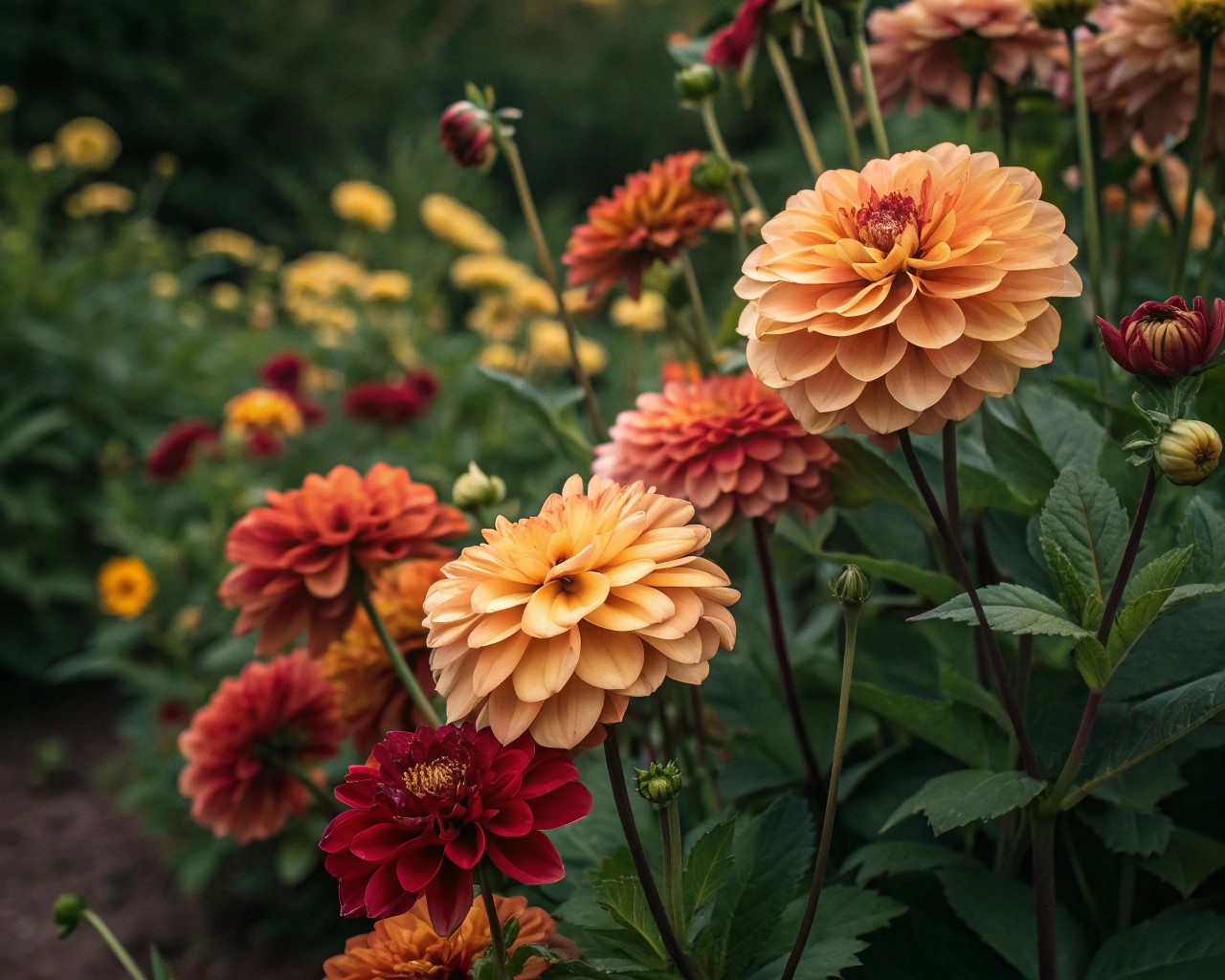
Temperature perception in color follows consistent patterns. Warm colors—reds, oranges, yellows—advance visually, making spaces feel more intimate and energetic. Cool colors—blues, purples, blue-greens—recede, creating depth and calm.
Warm Color Harmonies
Sunset-inspired palettes using coral, butterscotch, and deep red create vibrant, welcoming spaces. These combinations work particularly well in evening gardens where late sunlight intensifies warm hues, making them appear to glow. Pair flame-red Crocosmia with orange Helenium and yellow Achillea, allowing ornamental grasses in tawny browns to provide textural transitions.
In hot climates, however, warm colors can feel overwhelming during peak summer. Consider reserving intense warm palettes for spring and fall when temperatures moderate, or balance them with substantial plantings of cool silver and gray foliage.
Cool Color Harmonies
Blues, purples, and lavenders create restful compositions that feel spacious and contemplative. These colors work especially well in small gardens where you want to avoid visual crowding, and in hot climates where they provide psychological cooling.
Classic combinations like purple Salvia azurea with blue Aster laevis and gray-green Artemisia echo patterns seen in late-summer prairies. The analogous relationship (colors adjacent on the wheel) creates harmony without monotony.
Cool colors benefit from strategic punctuation. A drift of pale yellow Coreopsis among purple geraniums and blue nepeta adds spark without disrupting the overall calm.
White: The Unifier and Amplifier
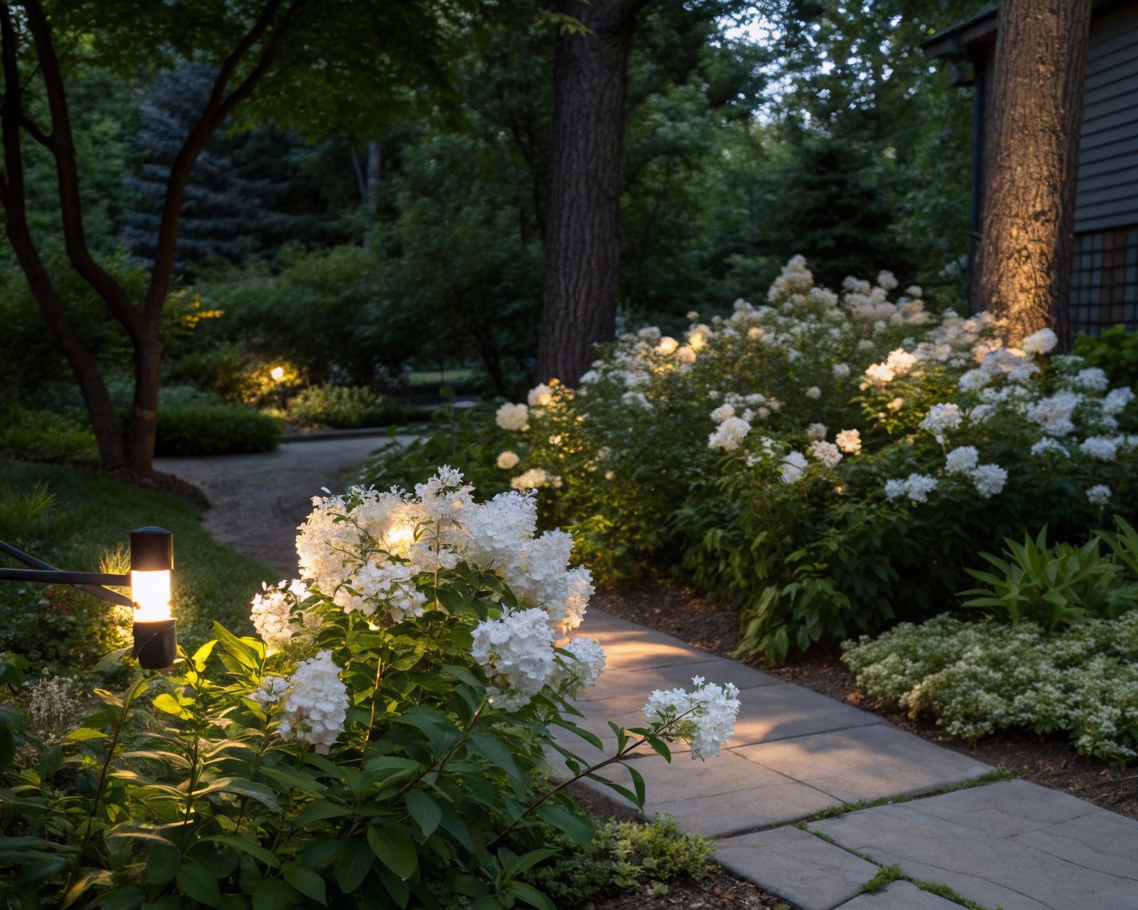
White functions uniquely in the garden. Neither warm nor cool by itself, white takes on the temperature of surrounding colors while serving several practical functions.
Brightening Shadow
In shade, white flowers and variegated foliage reflect available light, making dim areas feel more open and accessible. The glossy white blooms of Philadelphus (mock orange) paired with white Astilbe and variegated Hosta can transform a dark corner. Morning sun on these plantings creates an almost luminous quality.
Cooling Heat
In full-sun gardens, white provides visual relief from intense color. Intersperse white Echinacea or Phlox among hot-colored plantings to prevent visual exhaustion. The white breaks up saturated hues, giving the eye places to rest.
Bridging Clashing Colors
When colors jar against each other—perhaps a vivid magenta accidentally planted near scarlet—white can mediate. Place white-flowering plants between problem areas to create separation and reduce conflict.
Considerations for White Flowers
Not all whites age gracefully. Some turn brown as they fade, requiring thoughtful placement where newer blooms or vigorous foliage will obscure declining flowers. Creamy whites and those with subtle tints often integrate more naturally than stark, pure whites, which can read as harsh in some settings.
Analogous Schemes: Nature’s Easiest Harmony
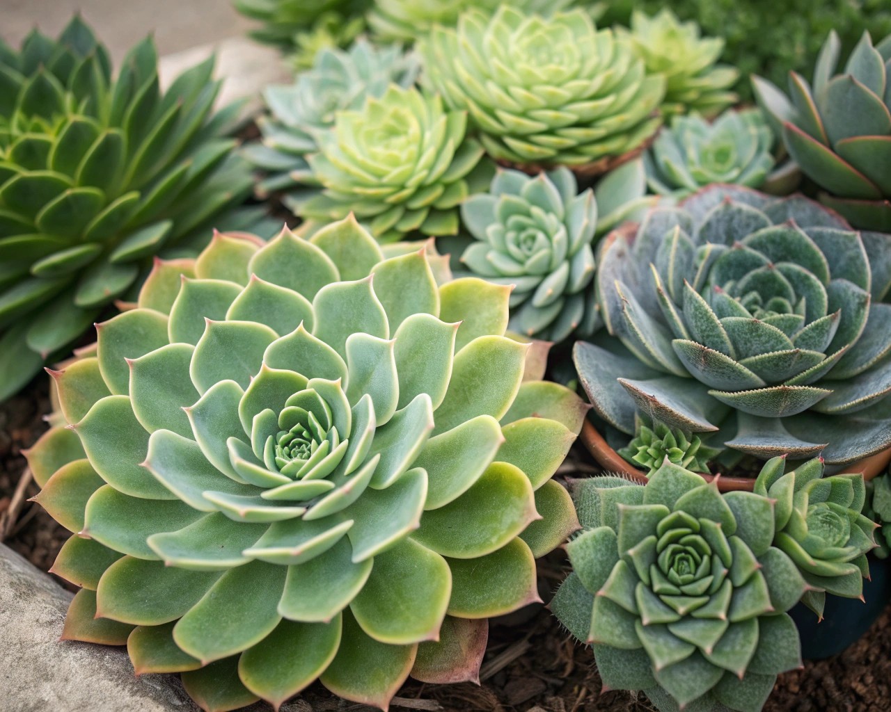
Analogous color schemes use three to four colors adjacent on the color wheel—for example, yellow through orange to red, or blue through purple to magenta. These combinations feel inherently harmonious because they share underlying pigments.
The classic yellow-orange-red progression mimics autumn foliage and prairie sunsets. Combine golden Rudbeckia, orange Helenium, and russet Sedum with bronze-toned grasses for a sequence that builds from late summer through fall.
For a cooler analogous scheme, transition from blue Nepeta through purple Salvia to pink Echinacea. This progression creates movement and visual interest while maintaining cohesion.
Adding Depth with Tints and Shades
Within an analogous scheme, vary color intensity. If working with purple, include deep eggplant Iris, medium purple Agastache, pale lavender Nepeta, and nearly white Phlox. This range of values creates dimension and prevents flatness.
Complementary Contrasts: Calculated Drama
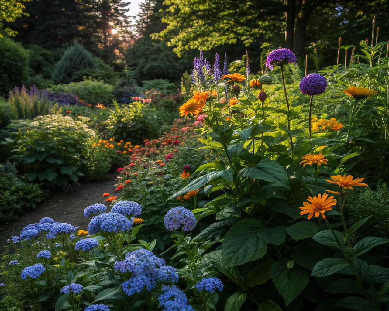
Complementary colors sit opposite each other on the wheel: yellow-purple, blue-orange, red-green. These pairings create maximum contrast and visual energy.
Classic Complementary Pairs
The yellow-purple combination appears frequently in both cultivated gardens and wild landscapes. Yellow Coreopsis against purple Salvia or heliotrope provides vibrant contrast that attracts pollinators and human attention equally. This pairing works because yellow advances while purple recedes, creating spatial dimension.
Blue and orange offer another powerful complementary relationship. Orange Kniphofia (red hot poker) with blue Agapanthus or Geranium ‘Rozanne’ generates intense visual impact. Use these combinations as focal points rather than throughout entire beds—their intensity can become overwhelming if overused.
Modulating Complementary Intensity
Pure complementary pairings create high drama, but you can soften the effect by using tints, shades, or tones. Instead of bright yellow and pure purple, try pale primrose yellow with lavender, or golden yellow with deep plum. These adjustments maintain contrast while reducing visual competition.
Alternatively, use the split-complementary approach: choose one color and pair it with the two colors adjacent to its complement. For example, pair yellow with red-violet and blue-violet instead of pure purple. This maintains contrast while introducing more complexity.
Monochromatic Sophistication
Working within a single color family—using only its tints, tones, and shades—creates understated elegance. A purple garden might include deep burgundy Cotinus, medium purple Salvia, lavender Nepeta, and pale pink Echinacea (pink being a tint of purple).
Monochromatic schemes feel restful and sophisticated but require careful attention to texture and form to avoid monotony. Combine bold, broad leaves with fine, ferny foliage; upright spikes with rounded mounds; glossy surfaces with matte ones.
Regional Considerations: What Belongs Where
Successful color selection responds to regional climate, light quality, and native plant communities. These factors influence both what thrives and what appears harmonious in your specific location.
Light Quality and Latitude
The angle and intensity of sunlight varies by latitude, affecting color perception. Closer to the equator, intense light can wash out pastels, making saturated colors more effective. In northern latitudes with softer light, subtle hues maintain visibility and often feel more appropriate.
Atmospheric conditions modify how we perceive color across distance. Moisture and particulates scatter short-wavelength blue light, making distant objects appear bluer and paler—the phenomenon called aerial perspective. Understanding this helps with placement: position cool, pale colors farther from viewing points to enhance depth, and place warm, saturated colors closer for immediate impact.
Native Plant Palettes
Regional native plants have adapted to local conditions over millennia, developing color combinations that reflect environmental realities. In the American prairie, golden sunflowers and Rudbeckia bloom alongside purple asters and Liatris because these colors and their bloom times support the same pollinator populations.
Desert regions feature plants with silver foliage and flowers in hot pinks, oranges, and yellows—colors that withstand intense UV radiation while attracting specialized pollinators. Woodland understories display subtle whites, pale yellows, and soft pinks that remain visible in dappled shade.
Working with—rather than against—these regional color tendencies creates gardens that feel rooted in place. A California garden might embrace the golden grasses, orange poppies, and purple lupines of coastal hills. A Northeast woodland garden could build on the white Trillium, blue Mertensia, and pale yellow Erythronium of spring woodlands.
Seasonal Color Sequencing
Natural landscapes shift color palettes as seasons progress. Early spring brings pastels—pale yellows, soft pinks, gentle blues. Summer intensifies into saturated hues. Fall transitions to rich golds, russets, and burgundies. Winter reveals structure through evergreen foliage and persistent berries.
Spring: Fresh and Optimistic
Spring’s palette emphasizes cool yellows, blues, and whites with touches of pink. These colors feel appropriate because they match the season’s emotional quality—renewal, hope, gentleness. Combine pale yellow daffodils with blue Mertensia, white Amelanchier blossoms, and pink Malus (flowering crabapple).
Summer: Bold and Abundant
Summer’s heat and intense light support stronger colors. This is when saturated oranges, hot pinks, deep purples, and bright whites work effectively. The classic cottage garden riot of color belongs to summer, when exuberant growth can support visual complexity.
Still, summer benefits from strategic restraint. Rather than using every color simultaneously, consider two-color themes that change every few weeks as different plants bloom. Early summer might feature yellow and blue, transitioning to purple and orange by mid-summer, then pink and white as autumn approaches.
Fall: Warm and Reflective
As light changes and temperatures cool, shift toward the warm side of the spectrum. Golds, russets, bronzes, and burgundies echo foliage changes and feel seasonally appropriate. Combine golden Solidago with rust-colored Sedum, burgundy Aster, and bronze grasses.
Winter: Structure and Subtlety
Winter color comes primarily from evergreen foliage in varied greens, persistent berries in reds and oranges, and ornamental bark. The palette becomes muted, allowing us to appreciate form and texture. This seasonal quietness makes spring’s returning color all the more impactful.
Practical Application: Building a Color Scheme
Translating color theory into an actual planting plan requires a methodical approach.
Step 1: Define Your Intent
What feeling do you want this space to evoke? Calm contemplation suggests cool colors with subtle variations. Energetic celebration calls for warm hues and complementary contrasts. Your answer guides every subsequent decision.
Step 2: Choose a Dominant Color
Select one color to anchor your scheme. This becomes your primary tool for creating cohesion. If you choose purple, commit to using it in multiple plants, varying only the specific shade and bloom time.
Step 3: Add Supporting Colors
Depending on your scheme type, add one to three additional colors:
- Analogous: Add colors adjacent to your primary (purple, blue, pink)
- Complementary: Add the opposite color (purple and yellow)
- Monochromatic: Stick with tints and shades of your primary
Step 4: Integrate Neutrals
White, silver, and varied greens act as buffers and transitions. Use them generously—they prevent color schemes from feeling chaotic or overwhelming.
Step 5: Plan for Succession
Ensure your color scheme persists across bloom times. If purple is your dominant color, select early-blooming Allium, mid-season Salvia, and late Aster in purple tones. Fill gaps with purple-leaved foliage plants that maintain color when flowers fade.
Common Pitfalls and Solutions
Too Many Colors
The most frequent mistake is using too many colors simultaneously, creating visual chaos. Solution: limit yourself to three or four colors maximum, relying on variations in shade and tone rather than introducing new hues.
Clashing Intensities
Colors at similar intensity levels compete for attention, even if they’re theoretically compatible. Solution: vary the value (lightness/darkness) and saturation (purity) within your scheme. Pair bright magenta with pale pink rather than equally bright red.
Ignoring Foliage
Focusing only on bloom color while ignoring foliage leads to disjointed designs. Solution: treat foliage as an integral part of your color palette, using it to extend and support flower color.
Inadequate Repetition
Single plants scattered throughout a bed fail to create visual impact. Solution: plant in groups of at least three to five for perennials, creating color masses rather than dots.
No Seasonal Planning
Brilliant color in May followed by green monotony in August reveals inadequate succession planning. Solution: map bloom times before planting, ensuring representation in each season.
Site-Specific Color Selection
Physical conditions—light, soil, exposure—should influence color choices as much as aesthetic preference.
Full Sun
Intense light supports bold, saturated colors and silvery foliage. Hot colors (reds, oranges, yellows) maintain visibility without washing out. White provides cooling relief and prevents visual fatigue.
Partial Shade
Dappled light favors medium-toned colors. Very dark or very pale hues may lose definition. Blues, purples, and pinks work well, as do yellow-greens. Avoid pure reds, which can appear muddy in reduced light.
Full Shade
Low light requires lighter colors for visibility. White, pale yellow, chartreuse, and pink remain distinguishable where deeper hues disappear. Variegated foliage adds brightness year-round.
Hot, Dry Sites
Heat and drought stress influence plant pigmentation. Choose plants with silver foliage and flowers in hot pinks, oranges, and yellows—species that have evolved protective pigmentation for these conditions.
Cool, Moist Sites
These conditions support plants with deep greens and flowers in blues, purples, and whites—hues that don’t require intense sunlight or protective anthocyanins.
Texture and Form as Color Modifiers
How we perceive color depends partly on the surface and structure presenting it.
Texture Effects
Glossy surfaces reflect light, intensifying color perception. Matte or velvety textures absorb light, making the same hue appear deeper and richer. A purple Salvia with glossy leaves reads differently than a purple Agastache with matte foliage, even if the flower color is identical.
Fine textures—small leaves, delicate flowers—appear softer and lighter in tone. Coarse textures—large leaves, substantial flowers—command more attention and appear weightier. Pairing fine purple Verbena with large-leaved purple Hosta creates textural contrast that makes both colors more interesting.
Form and Color Interaction
Upright, spiky forms draw the eye and make their color appear more prominent. Rounded, mounded forms feel softer and less insistent. Spreading, horizontal plants serve as transitions, allowing color to flow across the landscape.
A tall, upright purple Delphinium has more visual weight than an equal area of low, spreading purple thyme, even if the color is identical. Account for form when balancing color distribution.
Learning from Observation
The best color education comes from studying natural plant communities and successful gardens. Notice what grows together in your region’s wild spaces—these combinations have ecological logic and visual validity.
When a color combination works, analyze why: Are the colors analogous or complementary? What role does foliage play? How do textures interact? What’s the ratio of colors—equal amounts or one clearly dominant?
Photograph your garden throughout the seasons. Images reveal patterns you might miss in person and help identify color gaps or excesses. Use these observations to refine your approach over time.
Moving Forward
Choosing garden colors that feel natural and harmonious isn’t about rigidly following rules—it’s about understanding principles that allow for intuitive decision-making. Natural plant communities demonstrate that certain color relationships have ecological and visual logic. Warm colors energize. Cool colors calm. Analogous colors harmonize. Complementary colors contrast. White mediates and amplifies.
Start with restraint: a limited palette creates stronger impact than scattered rainbow chaos. Honor regional character: colors that work in desert sage will differ from those suited to woodland shade. Plan for time: gardens exist in four dimensions, with color moving through seasonal sequences.
The most successful gardens balance intention with flexibility—working with color theory while remaining responsive to what actually thrives in your particular place. Trust observation as much as instruction. Nature has already solved most color problems; our task is learning to see those solutions and translate them into our own designed landscapes.

