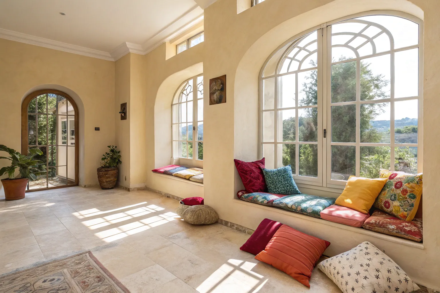
Neutral spaces possess an understated elegance that never goes out of style. I’ve watched countless homeowners struggle with the same concern: their beautifully serene rooms feel somehow incomplete, lacking the vibrancy that makes a house truly feel like home.
Understanding Your Neutral Foundation
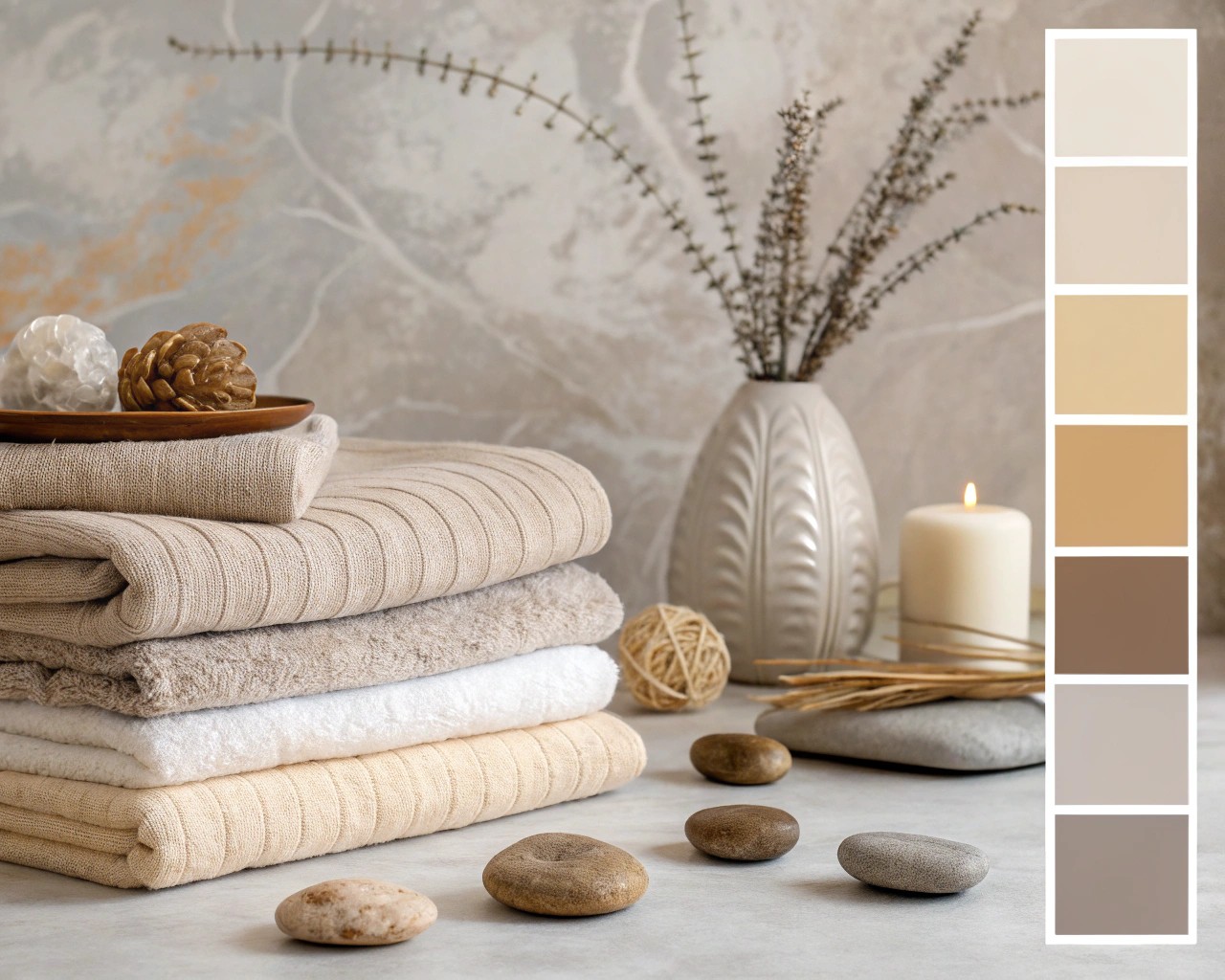
The beauty of a neutral palette lies in its versatility. Neutrals encompass far more than simple whites and grays—they include the full spectrum of beiges, taupes, greiges, ivories, and warm browns. Each carries distinct undertones that dramatically influence how color additions will perform in your space.
Warm neutrals contain undertones of yellow, orange, pink, or red, creating inviting, cozy atmospheres. These include colors like cream, beige, and taupe. Cool neutrals feature blue, green, or violet undertones, offering a crisp, modern aesthetic. Think of soft grays, greige, and certain whites with bluish casts.
The critical first step is identifying which neutral family dominates your space. Walk through your room and examine your walls, flooring, and largest furniture pieces under different lighting conditions. The undertones you discover will guide every color decision that follows.
The Science of Undertones and Light
Natural light profoundly affects how both neutrals and accent colors appear. North-facing rooms receive cooler, more subdued light that can make neutrals appear darker and less saturated. These spaces benefit from warm accent colors—think burnt orange, terracotta, or golden yellows—to counterbalance the cool light.
South-facing rooms flood with strong, clear light throughout the day, which amplifies warm undertones. Here, cooler accent colors like sage green, soft blues, or even deep teals prevent the space from feeling too warm or overwhelming.
East and west-facing rooms experience dramatic light shifts throughout the day. Eastern light starts warm and golden in the morning, becoming cooler by afternoon. Western light reverses this pattern. For these dynamic spaces, I recommend testing your color choices at multiple times throughout the day, particularly during the hours you’ll use the room most.
Testing Protocol for Color Confidence
| Time of Day | What to Observe | Why It Matters |
|---|---|---|
| Morning (7-9 AM) | How colors appear in soft, angled light | Reveals cool undertones; important for bedrooms and breakfast areas |
| Midday (11 AM-2 PM) | Colors under strongest natural light | Shows true saturation; undertones are most visible |
| Late Afternoon (4-6 PM) | Warm, golden hour effects | Warm light intensifies yellows and reds; softens blues |
| Evening (artificial light) | How lamp and overhead lighting affects hues | Essential for spaces used primarily after dark |
The 60-30-10 Framework for Color Integration
Professional designers rely on the 60-30-10 rule to create balanced, cohesive spaces. This proportional approach ensures color enhances rather than overwhelms your neutral foundation.
60% represents your dominant neutral color—typically walls, large furniture pieces, and flooring. This substantial majority creates the calm, grounding backdrop that defines neutral spaces.
30% becomes your secondary supporting color. This layer might appear in upholstered furniture, curtains, area rugs, or larger decorative elements. In neutral rooms seeking color infusion, this 30% can introduce your first intentional hue while maintaining overall restraint.
10% delivers your accent color—the bold, personality-driven touches that bring energy into the space. This is where confidence truly matters. Throw pillows, artwork, vases, small furniture pieces, and decorative objects occupy this category.
Consider a living room where cream walls and a beige sofa establish the 60% neutral base. A soft olive green area rug and matching curtains provide the 30% secondary layer, while terracotta throw pillows, amber glass accessories, and copper lighting fixtures deliver that critical 10% accent.
Strategic Color Psychology
Different hues evoke distinct psychological responses that should align with your room’s purpose.
Warm colors (reds, oranges, yellows, warm pinks) stimulate energy and conversation. In neutral living rooms or dining spaces, warm accents foster social connection and inviting atmospheres. However, use restraint—excessive warm tones can create feelings of restlessness.
Cool colors (blues, greens, purples) promote calmness and mental clarity. For bedrooms, home offices, or reading nooks within neutral schemes, cool accents support relaxation and focus. Deep blues particularly excel at adding sophistication without overwhelming neutral palettes.
Earth tones (terracotta, rust, olive, deep browns) bridge warm and cool, offering grounded sophistication. These work exceptionally well in neutral spaces because they share similar saturation levels with your neutral base, creating seamless visual flow.
I’ve found that monochromatic accent approaches—varying shades of a single color family—often deliver the most confident results in neutral rooms. A palette of sage, olive, and deep forest green, for instance, provides visual interest through tonal variation while maintaining cohesion.
Layering Texture: The Hidden Dimension
Before introducing color, master texture. Neutral spaces absolutely require textural diversity to avoid appearing flat or sterile. Texture creates visual interest and depth that allows color accents to truly shine.
Natural materials form the foundation of successful neutral rooms. Consider incorporating:
- Wood in varied finishes—warm oak, walnut, or lighter ash brings organic warmth
- Linen and cotton for soft furnishings, offering breathability and subtle visual texture
- Wool and bouclé in throws, pillows, or upholstery adding tactile comfort
- Rattan, jute, and seagrass through baskets, shades, or rugs introducing woven patterns
- Stone, marble, or ceramic in accessories and surfaces providing cool, smooth contrast
Layer these textures intentionally. A linen sofa gains dimension when styled with wool throws, velvet pillows, and a jute rug beneath. This textural foundation creates visual complexity that prevents your color accents from carrying the entire design burden.
Mixing Textures for Depth
- Pair rough with smooth: Rustic wood coffee table + polished marble accessories
- Combine matte and sheen: Flat-weave rug + velvet throw pillows
- Contrast heavy and light: Chunky knit blanket + delicate linen curtains
- Balance organic and refined: Natural fiber basket + brass candleholders
Biophilic Color: Bringing Nature Indoors
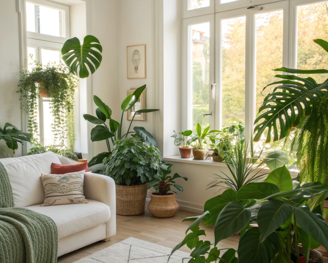
Plants represent the most accessible color introduction for hesitant designers. The biophilic design movement—incorporating natural elements into interiors—has demonstrated significant wellness benefits including stress reduction, improved air quality, and increased productivity.
For neutral spaces, plants provide dynamic color that changes with seasons and growth patterns. The varied greens—from deep forest tones to bright lime—naturally complement both warm and cool neutral undertones.
Strategic Plant Placement
Consider these options based on your lighting conditions:
Low-light tolerant (for north-facing or windowless areas): Snake plants, pothos, peace lilies
Bright indirect light (south and west-facing): Monstera, rubber plants, fiddle leaf figs
Cascading varieties (for shelving and vertical interest): Trailing pothos, string of pearls, spider plants
Statement specimens (as architectural focal points): Large monstera, rubber trees, birds of paradise
Beyond the greenery itself, consider how decorative pots introduce color. Terracotta planters add warm, earthy tones. Glazed ceramic vessels in soft blues or sage greens extend your color palette subtly. Even the simple act of grouping plants at varying heights creates visual rhythm that draws the eye through your neutral space.
Metallic Accents: Warmth Without Commitment
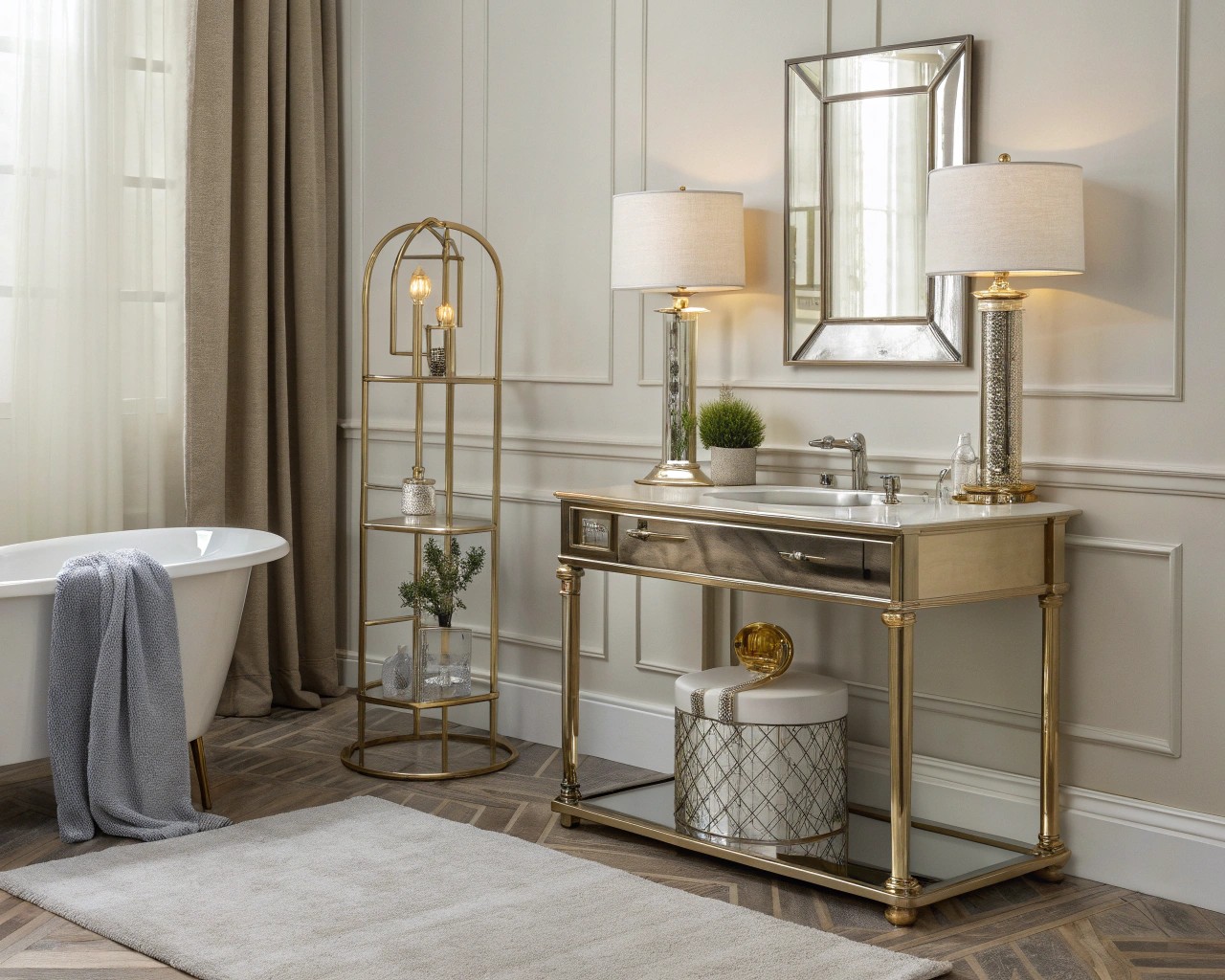
Metallic finishes offer a sophisticated middle ground between neutral restraint and bold color. They reflect light, add dimension, and introduce warmth or coolness depending on your selection.
Warm metallics—brass, copper, gold, and bronze—pair beautifully with warm neutral bases. These finishes gained prominence in recent years, replacing the cooler chrome and nickel that dominated earlier design trends. In a room with beige walls and warm wood tones, brass lighting fixtures, copper decorative bowls, and gold-framed mirrors add luxury without color commitment.
Cool metallics—silver, chrome, nickel, and pewter—complement cooler grays and greiges. For contemporary spaces with crisp white walls and gray furnishings, polished chrome hardware and silver-framed art maintain the clean aesthetic while adding reflective interest.
Black metal finishes—particularly matte black—have emerged as versatile neutralizers that work across warm and cool palettes. Black metal lighting, furniture legs, and hardware provide grounding visual weight that prevents neutral rooms from feeling too airy or insubstantial.
The beauty of metallic accents lies in their ability to be mixed. A room might feature brass candleholders, black metal chair legs, and copper pendant lights—all coexisting harmoniously when properly balanced. The key is choosing one metallic as dominant (appearing in at least 60% of metal finishes) with others playing supporting roles.
The Art of Statement Pieces
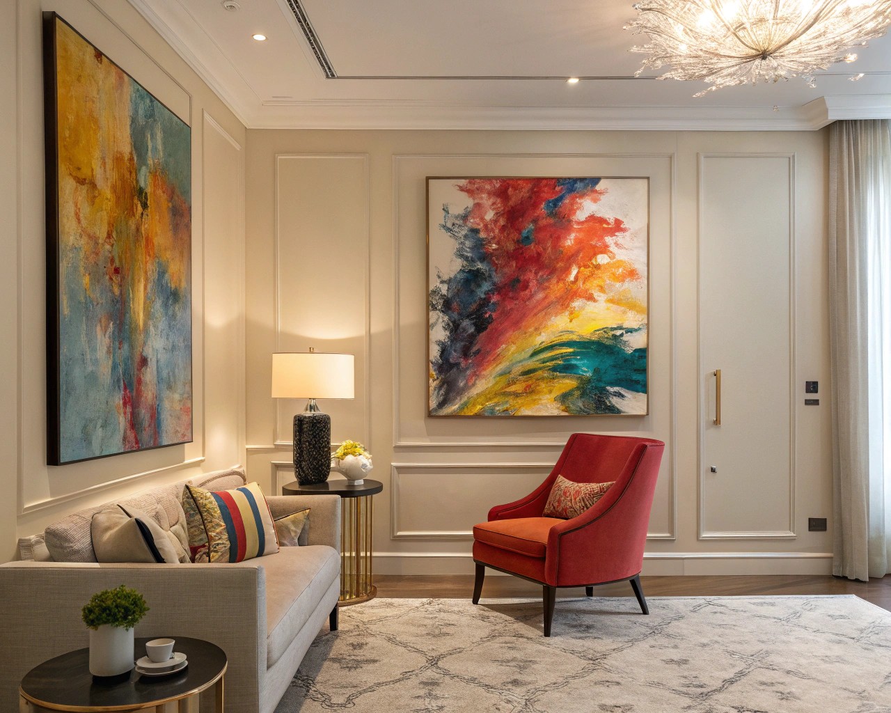
Large-scale art transforms neutral spaces more dramatically than any other single element. In rooms lacking architectural interest, a substantial artwork creates an instant focal point while introducing your chosen color palette.
Selecting Art for Neutral Rooms
Monochromatic abstracts in blacks, whites, and grays add sophistication without color commitment while varying texture and form create visual intrigue. These work particularly well when you want artwork to complement rather than compete with furniture.
Moody landscapes with nuanced color palettes inject depth into flat neutral spaces. Look for pieces with muted greens, soft blues, or earthy browns that echo rather than clash with your neutral foundation.
Bold graphic abstracts featuring high contrast and geometric patterns create drama and can anchor an entire color scheme. If you’re testing a new accent color, find artwork that incorporates it alongside neutrals—this provides a confident reference point for additional color additions throughout the room.
Colorful statement pieces in smaller formats allow experimentation without overwhelming commitment. A vivid abstract measuring 24″ × 24″ introduces significant color while remaining replaceable if your palette preferences evolve.
Scale matters tremendously. For walls above sofas, artwork should span roughly two-thirds of the furniture width. In dining rooms, pieces should hang at eye level when seated. Oversized art (48″ or larger) commands attention and justifies its presence, while undersized pieces can appear apologetic in spacious neutral rooms.
Seasonal Color Transitions
One of neutral spaces’ greatest advantages is their adaptability to seasonal color shifts. Rather than committing to permanent color decisions, you can rotate accent colors to reflect the changing year.
Spring palette: Soft pastels—blush pink, powder blue, pale lavender, and mint green—capture renewal and freshness. Introduce these through lightweight linen throw pillows, fresh flower arrangements, and delicate ceramic vases.
Summer approach: Embrace bolder, saturated hues—vibrant blues, sunny yellows, and lively greens—reflecting peak vitality. These work well in outdoor-adjacent spaces and rooms with abundant natural light. Consider temporary additions like bright outdoor cushions brought inside or colorful glassware displayed on open shelving.
Autumn transition: Rich, warm tones—burnt orange, deep burgundy, golden yellow, chocolate brown—create cozy intimacy as daylight wanes. Swap summer linens for wool throws, introduce rust-colored pillows, and display seasonal elements like branches with autumn leaves.
Winter palette: Embrace cool sophistication with icy blues, deep forest greens, crisp whites, and charcoal grays. Layer plush textures in these hues—velvet pillows, cable-knit throws, faux fur accents—to create warmth through tactility even as colors cool.
This seasonal approach allows you to test color preferences without permanent commitment. You might discover that autumn’s terracotta resonates so strongly that it becomes your year-round accent, or that winter’s deep green deserves permanent placement.
Practical Application: Room-by-Room Strategies
Living Rooms
Your most public space deserves confident color. Start with an area rug incorporating your chosen accent color alongside neutrals—this grounds the space and provides a color roadmap for additional accents. Layer in throw pillows (aim for odd numbers—3 or 5—for visual balance) that pull colors from the rug. Add a throw blanket in a complementary shade draped over the sofa arm.
If your neutral sofa feels lackluster, consider these approaches rather than replacement: reupholster just the cushions in a subtle accent color, add a tailored slipcover in seasonal hues, or style with a vibrant throw across the back.
Bedrooms
Restraint typically serves bedrooms best, as excessive color can disrupt sleep quality. I recommend introducing color through bedding—duvet covers and shams allow easy seasonal rotation. A single accent wall behind the headboard, painted in a muted blue or sage green, adds personality without overwhelming the restful atmosphere.
Consider the “envelope” approach: keep walls, ceiling, and flooring neutral, then add color only at eye level and below through bedding, a rug, artwork, and perhaps a reading chair in your accent fabric.
Dining Spaces
Dining rooms invite bolder choices since time spent is typically shorter and social in nature. An accent wall in a rich color—deep navy, forest green, or even dramatic charcoal—creates an intimate backdrop for gatherings. Alternatively, maintain neutral walls but introduce color through dining chairs, table linens, and a statement light fixture.
The table itself presents opportunity. Seasonal table settings allow color experimentation—spring’s pastels in napkins and dishes, autumn’s warm tones in table runners and centerpieces—without permanent commitment.
Kitchens and Bathrooms
In spaces dominated by fixed elements (cabinetry, tile, fixtures), introduce color through replaceable accessories. Kitchens benefit from colorful dishware displayed on open shelving, vibrant tea towels, small appliances in accent colors, and fresh herbs in colorful pots on windowsills.
Bathrooms offer similar opportunities: colored towels, bath mats, shower curtains, and accessories like soap dispensers and toothbrush holders inject personality into otherwise neutral schemes.
Common Pitfalls and Solutions
Mistake: Matching everything exactly
Color confidence doesn’t mean monotony. If you’ve chosen sage green as your accent, incorporate multiple shades—from pale mint to deep olive—rather than one repeated tone. This tonal variation creates sophisticated depth.
Mistake: Introducing too many accent colors
Stick to one or two accent colors beyond your neutral base. Three creates visual coherence; four or more often reads as chaotic rather than curated. If you love multiple colors, choose one as primary (appearing in 10% of the space) and another as a subtle secondary note (perhaps 5%).
Mistake: Neglecting scale and proportion
Small accents scattered throughout won’t register as intentional color. Group similar items—three throw pillows in your accent color together on the sofa rather than one on each piece of furniture. Create visual weight through clustering.
Mistake: Ignoring the room’s existing undertones
A cool gray room will fight against warm terracotta accents. Either work with your undertones (cool with cool, warm with warm) or commit to a full strategic contrast that feels intentional rather than accidental.
Building Confidence Through Experimentation
Start with temporary, low-commitment additions. Removable wallpaper on a single accent wall allows bold pattern experimentation without permanence. Peel-and-stick paint samples let you test multiple colors simultaneously on different walls. Seasonal decor—autumn pumpkins, spring tulips—introduces color with built-in exit strategies.
Pay attention to what brings you joy. If you’re drawn to a particular color in clothing, art you admire, or nature, that’s your intuition guiding you toward authentic choices. Trust those instincts.
As you add each element, step back and observe the space at different times of day. Does the color energize or calm you as intended? Does it complement rather than compete with other elements? This iterative approach builds genuine confidence far more effectively than attempting perfection on the first try.
The Confidence Mindset
Remember that neutral spaces aren’t failures requiring rescue—they’re canvases offering possibility. The restraint and sophistication you’ve already established through neutrals demonstrates design maturity. Adding color simply layers another dimension onto that foundation.
Color confidence comes not from bold choices but from intentional ones. A single coral pillow deliberately placed creates more impact than a dozen randomly selected accessories. Start with one accent color you genuinely love, introduce it thoughtfully using the 60-30-10 framework, and allow the space to evolve naturally.
Your neutral space already possesses elegance and calm. With strategic color additions, it gains vibrancy, personality, and the unmistakable warmth that transforms a beautifully designed room into a genuinely lived-in home.

