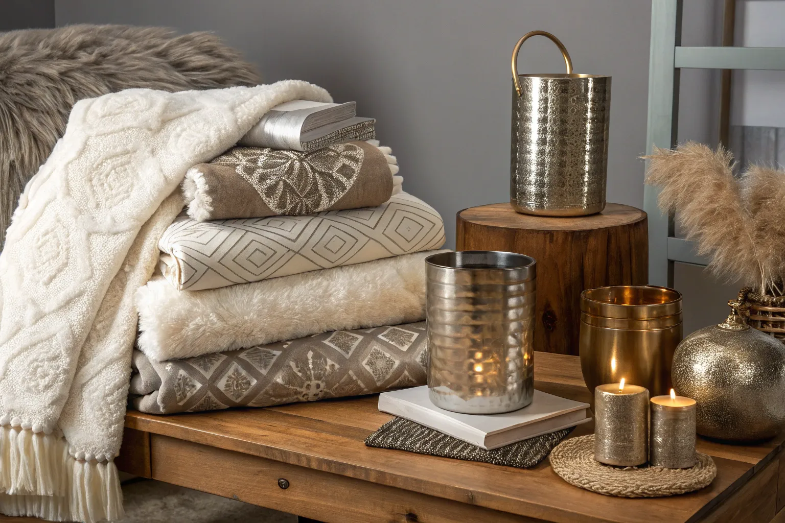
Achieving a designer aesthetic requires understanding the subtle interplay between proportion, material quality, and intentional styling—not an unlimited budget. I’ve watched countless homeowners transform ordinary spaces into sophisticated environments by mastering a handful of professional techniques and making strategic choices about where to invest their resources.
Understanding Designer Quality Elements
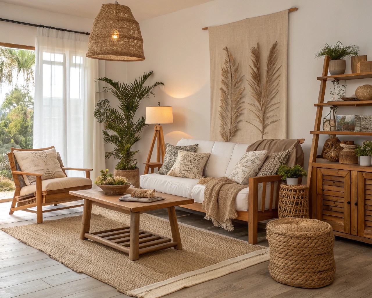
The difference between homemade-looking decor and designer-quality pieces often comes down to three fundamental principles that professionals use instinctively. Scale and proportion form the foundation—every object in a room relates to both the space itself and to neighboring elements. When furniture is properly scaled to ceiling height and room dimensions, even budget pieces appear intentional rather than haphazard. A sectional that’s too large makes a room feel cramped, while undersized furniture creates an unbalanced, sparse atmosphere.
Material integrity represents the second pillar. Designers prioritize natural materials—solid wood over veneer, linen over polyester, brass over plated metals—because these materials develop character rather than deteriorate. The tactile quality of genuine materials communicates luxury in ways that synthetic alternatives cannot replicate. Texture creates dimensionality; combining rough with smooth, matte with glossy, and woven with solid surfaces generates visual depth that flat, single-texture rooms lack.
Visual hierarchy completes the trinity of designer principles. Every successful room requires a clear focal point—an architectural feature, statement piece, or curated vignette that commands attention while supporting elements provide balance. Without this hierarchy, spaces feel chaotic regardless of individual piece quality.
Architectural Details That Transform Spaces
Panel Molding Applications
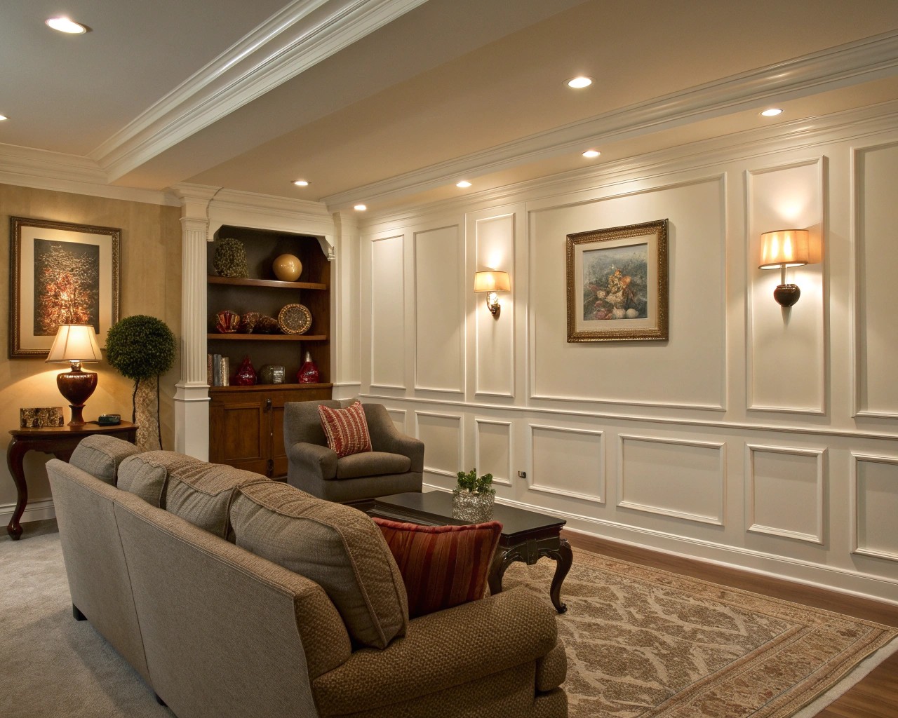
The fastest route to custom-looking walls involves picture frame molding, which creates the illusion of expensive paneling at a fraction of traditional costs. These thin strips of molding, available at any hardware store, can be cut to whatever dimensions suit your wall proportions. I’ve used this technique to transform builder-grade rooms into spaces that appear architecturally significant.
For standard 8-foot ceilings, position rectangles approximately 18-24 inches from the floor and 12 inches from the ceiling, maintaining equal spacing between panels. Higher ceilings allow for more dramatic proportions—follow the rule that panel height should be roughly 1.5 times the width to maintain classical proportions. After installation, fill nail holes meticulously and apply two coats of paint in the same finish as your walls for seamless integration.
Ceiling Treatments
Decorating the ceiling draws the eye upward and makes rooms feel taller than their actual dimensions. Simple grid patterns created from picture frame molding add Craftsman-style sophistication, while faux beams provide rustic architectural interest. For contemporary spaces, consider a single tray detail around the perimeter—this recessed or raised border adds definition without overwhelming minimalist aesthetics.
Window and Door Frame Upgrades
Replacing thin builder-grade trim with thicker casings (4-6 inches) instantly elevates perceived craftsmanship. This upgrade costs remarkably little—approximately $30-50 per opening—but delivers disproportionate visual impact. Paint frames in a contrasting color like charcoal, navy, or deep taupe rather than standard white to emphasize architectural lines and create a custom appearance.
Professional Paint Techniques
Beyond solid color application, decorative paint finishes add the dimensional quality found in designer spaces without requiring specialized skills.
| Technique | Best Application | Skill Level | Effect Achieved |
|---|---|---|---|
| Color Washing | Accent walls, dining rooms | Beginner | Soft, translucent depth |
| Dry Brushing | Textured walls, rustic spaces | Beginner | Graduated striping, aged appearance |
| Stippling | Formal spaces, ceilings | Intermediate | Even, subtle texture |
| Metallic Finishing | Feature walls, powder rooms | Advanced | Luminous, prismatic shimmer |
| Sponging | High-traffic areas | Beginner | Mottled coverage that hides imperfections |
Color washing delivers particularly elegant results with minimal practice. Mix paint with glazing medium at ratios between 70:30 and 95:5 depending on desired opacity—higher glaze ratios create more translucent, sophisticated effects. Apply with a soft-bristled brush using random, overlapping strokes. This technique works beautifully for creating depth on large surfaces and successfully disguises wall imperfections that would show through flat paint.
For metallic finishes, surface preparation becomes critical. Any imperfection will reflect in the light-catching surface. Use multiple thin coats rather than single heavy applications, and maintain consistent brush direction to avoid visible lap marks.
Custom Built-In Alternatives
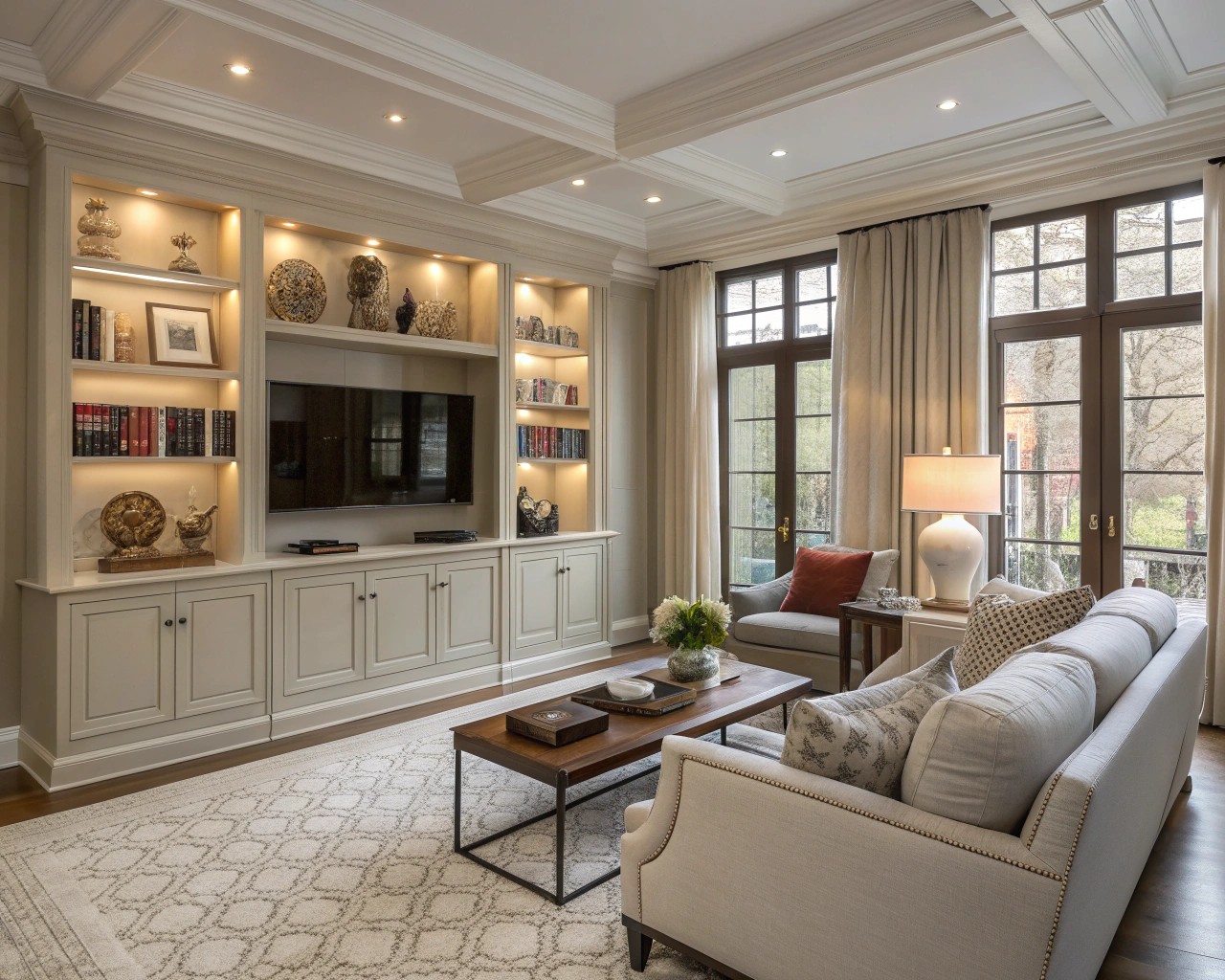
IKEA cabinetry systems provide the foundation for convincing faux built-ins at 20-30% of custom carpentry costs. The transformation from flat-pack to custom requires several finishing steps that professionals employ.
The Integration Process
Start by building a simple frame from dimensional lumber between the IKEA unit and surrounding walls. This frame should be secured with appropriate wall anchors—toggle bolts for drywall, wood screws for studs. Cover this framing with ¼-inch plywood or MDF panels to create continuous surfaces between furniture and architecture. The thickness you choose depends on how substantial you want the built-in to appear.
Fill all seams, joints, and nail holes with spackling compound, then sand smooth once dry. This step separates amateur projects from professional results—visible seams immediately reveal the illusion. Apply primer before two finish coats of paint to ensure uniform coverage.
Hardware as Transformation
Cabinet hardware functions as jewelry for built-ins. Replacing IKEA’s standard pulls with substantial options elevates the entire installation. Look for solid brass or bronze hardware with weight and dimension—thin, lightweight pulls undermine the custom illusion. Spacing matters: center pulls on drawer fronts and position them 2-3 inches from the bottom edge on doors for proper visual balance.
Budget-conscious options exist. Companies like Traditional Hardware and HRL Brass offer quality designs at accessible price points, typically $4-15 per piece. For the highest-end appearance at lower costs, select zinc-based hardware with durable finishes rather than solid brass, which can cost 3-4 times more for similar visual effect.
Textile Selection for Luxury Appearance
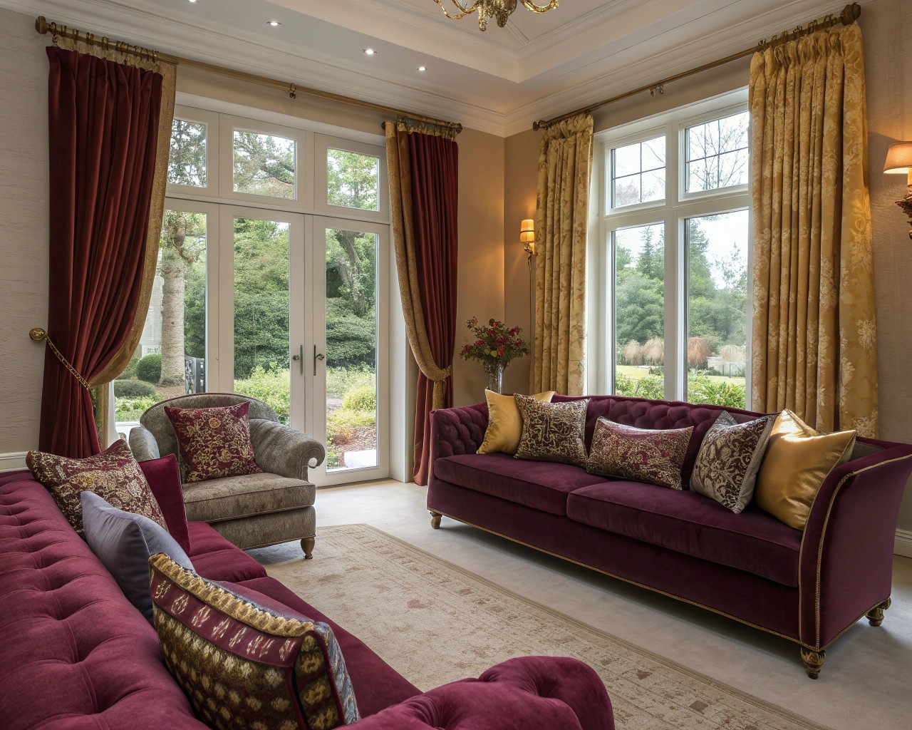
Fabric choices dramatically impact perceived quality, but understanding where to invest versus economize allows sophisticated results within budget constraints.
Strategic Fabric Investment
Reserve expensive natural fabrics—pure linen, silk velvet, leather—for high-visibility areas like primary drapery panels, main sofa upholstery, or bedding. These are the surfaces guests and residents interact with most frequently, making their quality immediately apparent. For less prominent applications—closet window treatments, accent pillows, throw blankets—high-quality synthetic blends in linen-look polyester or cotton-poly mixes provide similar aesthetics at fraction of costs.
Linen offers affordable luxury when purchased as blends rather than pure fiber. A 55% linen/45% cotton blend maintains linen’s characteristic texture and drape while reducing price by 40-50% and improving wrinkle resistance. Similarly, viscose (rayon) provides silk’s fluid drape and subtle sheen at significantly lower investment.
Window Treatment Excellence
Professional window treatments follow specific proportions. Hang curtain rods 4-6 inches above window frames and extend them 8-12 inches beyond each side of the window opening. This positioning makes windows appear larger while ensuring adequate fabric fullness when panels are drawn.
For designer appearance, measure panels to break at the floor—they should kiss the ground or puddle slightly (½ to 1 inch excess) rather than hovering above it. Budget panels can be customized using iron-on hemming tape to achieve perfect length without sewing skills.
Adding trim transforms ordinary panels into custom pieces. Grosgrain ribbon, gimp braid, or decorative tape applied down the leading edges provides defining detail that mimics expensive fabrication. Apply with fabric glue or fusible web tape for no-sew application.
Color Theory Application
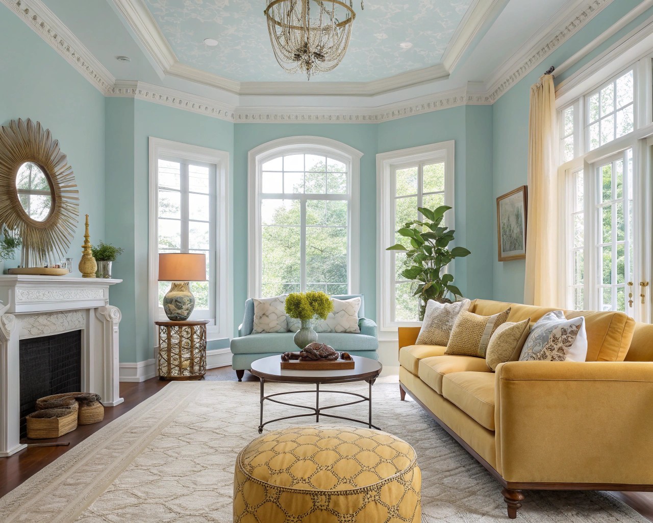
Professional color schemes rely on mathematical proportions rather than intuition. The 60-30-10 rule provides foolproof balance: 60% dominant color (typically walls), 30% secondary color (major furniture and textiles), 10% accent color (accessories and art).
Within this framework, use a single “hero” color that appears in every room to create flow throughout the home. This doesn’t mean painting everything the same—the hero color might be the primary wall color in one space, appear as accent pillows in another, and show up in artwork elsewhere. This repetition creates subconscious coherence.
Analogous and Complementary Strategies
Analogous schemes—three adjacent colors on the color wheel—create sophisticated harmony. Blue, blue-green, and green work together naturally, as do yellow, yellow-orange, and orange. For spaces requiring more energy, introduce a complementary accent (the color directly opposite your primary hue) at that 10% ratio. Orange accents energize blue rooms; red adds punch to green spaces.
Color temperature affects spatial perception. Cool tones (blues, greens, purples) recede visually, making small rooms feel larger. Warm hues (reds, oranges, yellows) advance, creating coziness in oversized spaces. North-facing rooms benefit from warm palettes to counteract cool natural light, while south-facing spaces can handle cooler tones.
Professional Styling Techniques
Vignette Creation
Vignettes—curated groupings of 3-5 objects—provide focal points that communicate intentional design. Successful vignettes employ specific compositional principles that distinguish them from random clutter.
Start with varied heights. Include one tall element (12-18 inches), one medium piece (6-10 inches), and one low object (3-5 inches). This creates visual rhythm as the eye travels through the arrangement. Layer depth by positioning larger items toward the back and smaller pieces forward.
Restrict your color palette. Even disparate objects appear cohesive when they share 2-3 unifying colors. A vignette might include cream, navy, and brass elements regardless of whether you’re combining books, ceramics, botanical elements, and textiles. This color discipline creates harmony despite material diversity.
Use the rule of odds. Groupings of three or five objects appear more visually appealing than even numbers, which can feel too symmetrical and static. Incorporate negative space—leave areas intentionally empty so individual objects can breathe and register visually.
Strategic Accessory Placement
Accessories require thoughtful limitation. Following the five-accessory maximum prevents visual overload. This count includes jewelry, hair accessories, and statement pieces in your field of vision at any given angle. A styled bookshelf might display a decorative box, small sculpture, and plant grouping—three items total—allowing each adequate visual prominence.
For wall art, hang pieces so their centers sit at 57-60 inches from the floor (standard gallery height). Above furniture, artwork should span 50-75% of the furniture width and hang 8-10 inches above the piece. These specific measurements create professional proportions that untrained eyes register as “correct” without understanding why.
Mixing High and Low Investment
Strategic spending distinguishes designer-looking spaces from those that merely consumed large budgets. Invest in foundational pieces that anchor rooms and experience heavy use—primary sofas, dining tables, bed frames, quality area rugs. These items should be solid wood or quality upholstery that will last 10-15 years.
Economize on accent pieces with shorter lifecycles—side tables, decorative lighting, seasonal accessories, trendy decor. These items can be budget-friendly because they’re easily replaced as tastes evolve. A $2,000 sofa paired with $150 side tables from a mass retailer creates the same visual impact as if all pieces were expensive, because the substantial sofa establishes quality expectations.
Mix eras and sources deliberately. Vintage pieces from estate sales or antique shops add character unavailable in new production furniture. A genuinely aged wood sideboard brings patina and story that new furniture cannot replicate, often at prices below contemporary mass-market equivalents.
Layout Fundamentals
Furniture arrangement errors undermine even quality pieces. Avoid pushing furniture against walls—this creates disconnected, uninviting spaces. Instead, float seating groups away from perimeters, anchored by appropriately sized area rugs. Rugs should be large enough that all furniture front legs rest on the rug surface.
Maintain 24-30 inches of walking space around furniture groupings for comfortable traffic flow. Position seating pieces 8-10 feet apart maximum to enable easy conversation without shouting. Coffee tables should sit 14-18 inches from sofa edges—close enough for convenient use, distant enough to avoid shin collision.
Lighting as Jewelry
Professional lighting design employs multiple sources at varying heights rather than relying on overhead fixtures. This layered approach creates dimensional illumination that flatters spaces and inhabitants.
Install dimmer switches on all controllable fixtures. This $15-25 investment per switch allows you to adjust lighting intensity for different times of day and activities. Dimmed lighting creates ambiance impossible with single-intensity illumination.
Position table lamps at 58-62 inches finished height (including shade) in living spaces, placing them on end tables flanking sofas or chairs. This height illuminates faces attractively during conversation while providing adequate task lighting for reading. Floor lamps work well in corners or beside seating that lacks adjacent tables.
Avoid matching lamp sets—this reads as retail display rather than curated design. Instead, select lamps that share a unifying element (similar scale, complementary finishes, or tonal relationship) while maintaining distinct forms.
Finishing Details That Matter
Small refinements separate near-professional results from truly designer appearances. Update basic white plastic switches and outlets to brushed nickel, matte black, or brass finishes that complement your hardware. This detail costs approximately $3-8 per plate but eliminates a glaring indicator of builder-grade finishing.
Replace basic door hardware—hinges, knobs, strike plates—with quality matching finishes. Doors are touched multiple times daily, making hardware quality immediately noticeable. Substantial, weighted hardware suggests overall home quality more than many larger investments.
Edit ruthlessly. Rooms feel more expensive with fewer, better-chosen items than with surfaces crowded with multiple lesser pieces. If a vignette or arrangement feels cluttered, remove elements until it breathes visually. Professional design embraces negative space as an active design element rather than void requiring filling.
Creating designer-quality decor without designer budgets requires understanding the principles professionals apply instinctively. Scale, proportion, material integrity, and strategic investment consistently outperform unlimited spending on random purchases. By focusing resources on foundational pieces and architectural enhancements while economizing on easily changed elements, you create spaces with both immediate impact and long-term satisfaction. The transformation happens not through expensive items, but through applying professional techniques to whatever resources you have available.

